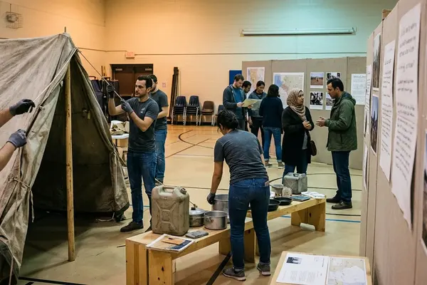
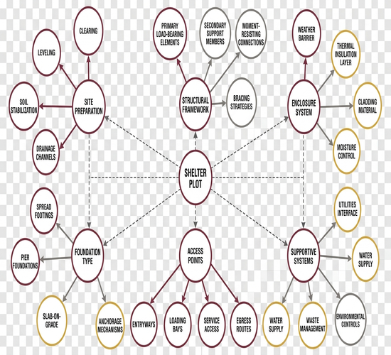
I still remember the first camp exhibit that stopped treating aid as a row of labeled objects. Instead of a tarp folded on a plinth, curators mapped a standard family plot footprint on the floor so visitors could feel how tight roughly 3.5 square meters of covered living space per person actually is. Shelters, water points, and service markers sat in relation to one another. The room stopped looking like a museum case and started looking like a system under pressure.
That shift matters. Exhibits can make material conditions and spatial relationships visible. They cannot reproduce the changing systems, constraints, and decisions of an emergency operation. Once you accept that limit, the display becomes useful again.
In this Article
- From Displayed Objects to Simulated Camp Systems
- What Objects, Maps, and Guided Interpretation Can Represent
- Where the Exhibit Simplifies Emergency Operations
- The Operational Work That Remains Invisible
- How to Read a Camp Exhibit Without Confusing It With the Field
- A Classroom Test for Evidence, Interpretation, and Omission
From Displayed Objects to Simulated Camp Systems
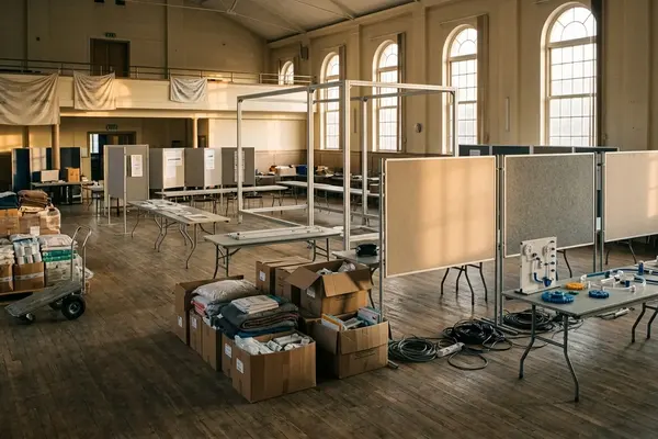
Early humanitarian displays favored the artifact: a jerry can, a registration card, a sample ration. Visitors left knowing what the object looked like and little else. The newer approach rebuilds fragments of camp space. Designers place shelter frames beside latrine components, mark clinic access, and hang site maps at eye level so density and distance become part of the lesson.
I treat that reconstruction as a teaching tool, not a substitute for field work. The plot lines show constraint. The service markers show intended order. Neither shows the hour-by-hour revision that follows a population influx or a broken pump.
Three-Layer Read
- What visitors can observe: materials, spacing, labeled service points, and the physical bulk of everyday aid items.
- What guided interpretation can explain: intended use, maintenance needs, and how one object sits inside a wider response chain.
- What remains outside the exhibit: shifting priorities, delayed consignments, contested access, and the decisions that rewrite the plan overnight.
Keep those three layers separate and the exhibit earns its place in public education. Collapse them and the room starts to pretend it is the camp.
What Objects, Maps, and Guided Interpretation Can Represent
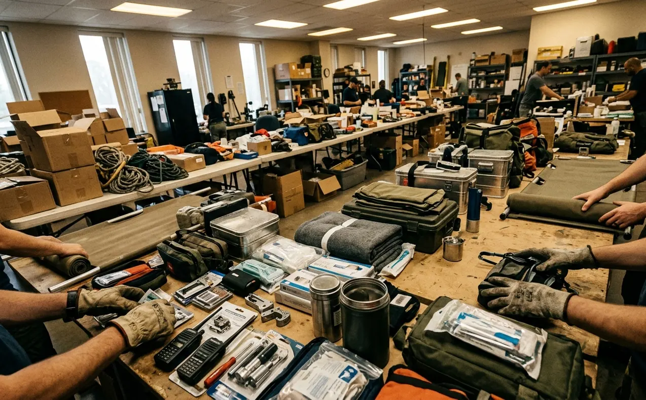
Shelter sheeting, poles, and rope give form to a household claim on space. Fifteen-liter collapsible water containers make daily water collection tangible in a way a poster never will. Sanitation components, including a VIP latrine slab and vent pipe, show how waste is kept away from living areas when the design is followed. Medical kits, registration documents, and distribution equipment complete the set: each item is a hinge between policy and a body that needs protection.
Maps do different work. A good site plan clarifies distance between shelters and clinics, the density of plots, the placement of water points, and the routes people actually walk to a distribution area. Visitors who only see objects miss the geometry of waiting, queuing, and return trips with full containers.
Exhibit designers paired physical artifacts with logistical documentation so guides could trace a water container back to its distribution manifest. That pairing is where interpretation earns its keep. A skilled guide connects an isolated object to its users, its failure modes, and the maintenance cycle that keeps it in service. Without that voice, the room is inventory.
Guide Value
Ask the guide to name the next step after the object leaves the warehouse. If the answer stops at “it is distributed,” the interpretation is still incomplete.
Where the Exhibit Simplifies Emergency Operations
Field conditions move. Populations relocate within a site, drainage fails after rain, wind strips sheeting, a road washes out, and a delayed truck rewrites the week’s ration plan. An exhibit freezes one arrangement so visitors can study it. That freeze is a design choice with costs.
One design team opted for a fixed spatial layout and rejected an earlier proposal to use motorized partitions that would simulate shifting camp boundaries. The mechanical complexity overshadowed the teaching goal. The fixed room is clearer. It is also easier to misread as permanence.
A displayed aid item reveals design and intended capacity. It does not reveal procurement delays, transport limits, inventory control, repair cycles, replacement decisions, or disposal. Standard polyethylene tarpaulins under high UV exposure follow a degradation cycle of roughly six months; the clean sheet on the wall rarely shows the patched, brittle stage that crews actually manage.
Maps freeze a moment. They can conceal congestion at water points, informal footpaths cut through drainage lines, damaged access roads, restricted zones, and uncertainty in population figures. Static exhibit layouts fail as educational tools when visitors mistake the frozen diorama for the volatile, daily reality of a camp undergoing rapid population influxes.
Layout Trap
If the floor plan looks settled, ask which week it represents and what would force a redraw. Acute emergency phases and protracted displacement impose different logistical constraints; a single map cannot carry both without explanation.
The Operational Work That Remains Invisible
The work that keeps a camp functioning rarely fits on a label. I group it as logistics, public health, staffing, coordination, information, and access. Those categories overlap in the field, yet separating them helps visitors see why a tidy display understates the load.
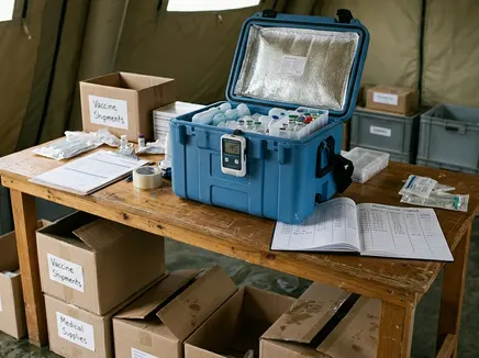
Researchers structured one unseen-work narrative by tracing the lifecycle of a single medical intervention and mapping the procurement, transport, and waste disposal required for a vaccination campaign. Forecasting sets the order. Purchasing locks suppliers and timelines. Transport moves the cold boxes. Storage holds them inside the 2°C to 8°C temperature range required for cold-chain vaccine storage. Equipment maintenance keeps generators and fridges alive. Waste handling closes the loop. Contingency planning covers the power cut that arrives at the worst hour.
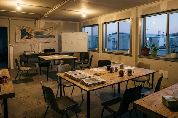
Staffing is its own system. Schedules, supervision, language access, specialist availability, handovers, and safety procedures determine whether a clinic opens on time. Local and displaced workers need sustained support, not a one-day orientation. Coordination meetings decide who owns a blockage at the gate. Information teams revise headcounts that were already wrong by morning. Access negotiations reopen roads that maps still show as open.
None of that fits beside a neatly stacked crate. The crate is honest about volume. It is silent about the chain that filled it.
How to Read a Camp Exhibit Without Confusing It With the Field
Educators developed a critical reading framework that prompts visitors to select one physical item and verbally reconstruct its missing supply chain during the walkthrough. I use a short sequence that fits inside the 45-minute span of a standard guided interpretive tour.
- Identify the scenario the room claims to represent: emergency phase, protracted settlement, or a hybrid sketch.
- Establish the time frame. A dry-season layout teaches different lessons from a flood week.
- Inspect what has been selected and what has been left out of the frame.
- For each major object, ask which system keeps it working: water, sanitation, health, shelter repair, or registration.
- Record absences out loud: fuel, spare parts, night lighting, complaint desks, burial space, or the queue itself.
Distinguish an authentic object from an authentic account of how, where, and under what constraints it was used. A genuine registration form can still sit inside a simplified story. Ask who supplied the interpretation, whose perspective is included, whether displaced people appear as decision-makers, and which operational uncertainties the labels admit. If the room only shows beneficiaries receiving, the operational picture is already skewed.
A Classroom Test for Evidence, Interpretation, and Omission
Instructors designed a classification exercise requiring students to physically tag exhibit components with color-coded markers. The exercise runs on a three-tier rubric: direct observation, curatorial interpretation, and acknowledged gap. Some classrooms add a fourth mark for operational inference when students must reason beyond the label without inventing certainty.
Have students compare a shelter bay, a site map, a water point, or a medical item with the people, decisions, supply systems, and changing conditions required for it to function. One group reconstructs the cold chain behind a vaccine carrier. Another maps the emptying cycle behind a VIP latrine. A third lists what a distribution table hides about ration revisions after a delayed convoy.
Assess whether students can explain both the exhibit’s educational value and the limits of conclusions drawn from it. Strong answers name what the room makes visible and stop short of treating the floor plan as a living camp. Weak answers recite object names and call that understanding.
When you next stand inside a reconstructed plot line, which single missing system would you force the exhibit to show before you trusted the story it tells?